Step-by-Step Guide to Using ngx-photo-editor in Angular
Introduction
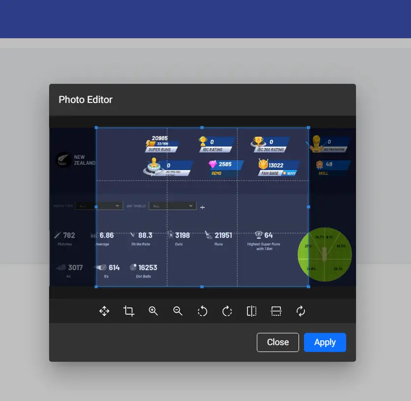
In this tutorial, we will integrate ngx-photo-editor into an Angular project to allow users to crop and edit images with a simple UI. The final implementation will include file selection, cropping, and an option to download the edited image.
Prerequisites
Before we begin, make sure you have the following installed:
- Node.js and npm
- Angular CLI
Step 1: Create a New Angular Project
If you don’t have an Angular project yet, create one using the following command:
|
1 2 |
ng new ngx-photo-editor-demo cd ngx-photo-editor-demo |
Step 2: Install Dependencies
We need to install ngx-photo-editor and @angular/material for the modal dialog.
|
1 |
npm install ngx-photo-editor @angular/material |
Run the Angular Material setup command:
|
1 |
ng add @angular/material |
Choose a theme and set up typography and animations as prompted.
Step 3: Import Required Modules
Open app.module.ts and import the necessary modules.
|
1 2 3 4 5 6 7 8 9 10 11 12 13 14 15 16 17 18 19 |
import { NgModule } from '@angular/core'; import { BrowserModule } from '@angular/platform-browser'; import { AppComponent } from './app.component'; import { BrowserAnimationsModule } from '@angular/platform-browser/animations'; import { MatDialogModule } from '@angular/material/dialog'; import { PhotoEditorModule } from 'ngx-photo-editor'; @NgModule({ declarations: [AppComponent], imports: [ BrowserModule, BrowserAnimationsModule, MatDialogModule, PhotoEditorModule ], providers: [], bootstrap: [AppComponent] }) export class AppModule {} |
Step 4: Implement File Upload and Photo Editor
Modify app.component.ts to handle file selection and open the editor.
|
1 2 3 4 5 6 7 8 9 10 11 12 13 14 15 16 17 18 19 20 21 22 23 24 25 26 27 28 29 30 31 32 33 34 35 36 37 38 39 40 41 42 43 44 45 46 47 48 |
import { Component } from '@angular/core'; import { MatDialog } from '@angular/material/dialog'; import { PhotoEditorModalComponent, PhotoEditorOptions } from 'ngx-photo-editor'; @Component({ selector: 'app-root', templateUrl: './app.component.html', styleUrls: ['./app.component.css'] }) export class AppComponent { croppedImage: any = ''; constructor(private dialog: MatDialog) {} openPhotoEditor(event: any): void { const file = event.target.files[0]; if (!file) return; const reader = new FileReader(); reader.onload = (e: any) => { const dialogRef = this.dialog.open(PhotoEditorModalComponent, { width: '80%', data: { image: e.target.result, options: { aspectRatio: 4 / 3, autoCropArea: 1, resizeToWidth: 128, } as PhotoEditorOptions } }); dialogRef.afterClosed().subscribe((result: any) => { if (result) { this.croppedImage = result.base64; } }); }; reader.readAsDataURL(file); } downloadCroppedImage(): void { const link = document.createElement('a'); link.href = this.croppedImage; link.download = 'cropped-image.png'; link.click(); } } |
Step 5: Create the HTML Template
Modify app.component.html to include a file input, cropping area, and download button.
|
1 2 3 4 5 6 7 |
<input type="file" (change)="openPhotoEditor($event)" /> <div *ngIf="croppedImage"> <h3>Preview:</h3> <img [src]="croppedImage" alt="Cropped Image" /> <button (click)="downloadCroppedImage()">Download Cropped Image</button> </div> |